
ActionsBrand Book
The single source of truth for the Actions brand: why we exist, how we look, and how we sound. Synthesized from Brand Book v1 and tokenized for the products we build.
Internal. Values marked “Proposed” extend the brand book and need sign-off.

01
Brand Foundations
Why this brand exists, where it is going, and how we work every day.
Purpose
We’re here to be first-check and mission-aligned partners to founders who are building consequential companies.
We’re here because we love helping to create things from scratch. We’re here to match our founders’ intensity by working just as hard as they do. We’re here to see the idea all the way to successful company reality.
Vision
To build the strongest first-check VC platform for founders solving global problems in critical industries.
The brand’s long-term goal and aspiration.
Northstar · the guiding principle to refer back to again and again
Is everything we’re doing helping to further our founders and support the actions they take so their company can make the maximum impact?
Ways of working · how we go about doing things day to day
We go through everything with founders, so we know the challenges of building a company from scratch.
When a founder runs into something, good or bad, they call us: day or night.
We work with them as it happens, so they can make the most informed long-term decisions.
02
Core Proposition
The fastest way to explain who we are, and the actions that prove it.
Tagline
Actions create consequential companies.
At Actions, we are all about “the doing.” It’s what we do every day that helps founders make the moves with the most impact, within their company and in the world.
Use it sparingly, like a main headline, as it is on the website.
Don’t lock it up with the logo. The double mention of “actions” sounds repetitive.
Core Actions
It takes more than “beliefs” or “values” to make real impact. So these are the actions we take.
All In, No Doubt
We show higher conviction by outworking other VCs. Founders empathize with this, and LPs respect it. We’re always hungry and don’t take the summers off. We make 2–3 investments per partner, so it’s a partner-led collective effort that taps our broader network of LPs, founders, and venture partners.
Empathy as a Superpower
We provide the support we wish we had as founders. We’ve been there; we know the highs and lows. Every situation is unique, so we work with founders to make empowered decisions.
Beyond Cheerleading
We advise on what’s best for founders to do as a company, not what founders want to hear or what’s best for the fund. In the long term these are the same. We don’t sugar-coat things.
Nothing’s Too Early or Weird
When something looks complicated or will require major effort, the classic VC response is “It’s a little too early.” Pre-seed is all we do, so we know how to wrap our minds around the complications.
Group Dynamics are Key
Building a company takes a village. We’re building the roads and rails for a strong support system, and a shorter learning curve, for our founders.
03
Visual Identity
Logo, colour, type, and the shapes that hold them together. Click any swatch to copy its hex value.
01The logo system
Our identity has two elements: the brandmark and the logotype. Together they create the logo. The brandmark may be used on its own; the logotype is never shown without the brandmark.

- The brandmark
- Three planes, each three quarters the size of the plane behind it, stepping up and to the right.
- The logotype
- “actions” set in lowercase. Use the artwork; never retype it.
- The logo
- The brandmark and the logotype together, in one of three lockups.
Lockups · three arrangements for different uses


Shading · subtle shade is preferred; solid helps at small sizes


Colourways · Not White on dark, Not Black on light, Violet “for companies, concepts, approaches, and things”





Clear space · measured in the height of the “i”
Lockups 1 and 2
Leave at least the height of the “i” on every side, and ideally twice that.
Lockup 3
Leave at least twice the height of the “i” on every side.
Brandmark alone
Leave at least the height of its smallest plane on every side.
On colour and imagery
Apply colourways consistently and keep the brand legible on every background and photograph.
Minimum size Proposed
Brandmark 16px tall, and solid below 32px. Lockups 80px wide.
File formats
SVG for web and print. Transparent PNG for documents and Google Slides.
Lined brandmark: needs decision. Brand Book v1 shows a hatched version of the brandmark marked “Needs decision.” Don’t use it until it is approved.
02Colour
Our dominant theme is light: off-whites so close they are almost impossible to tell apart, hence the name Not White. Not Black is only used for copy. The accents are used sparingly and have specific jobs.
Distribution · a guide rather than a formula
Not WhiteNot BlackVioletAcid
Scales · the core swatch is underlined in Acid
Legible pairings · contrast computed live from the tokens (WCAG 2)
| Pairing | Sample | Ratio | Result | Use |
|---|---|---|---|---|
| Not Black on Not White | Body copy | |||
| Violet 600 on Not White | Headlines | |||
| Violet 500 on Not White | Accents, larger text | |||
| Not White on Violet 800 | Copy on violet panels | |||
| Violet 200 on Violet 800 | Small text on violet | |||
| Violet 400 on Violet 800 | Large headlines on violet only | |||
| Not Black on Acid | CTA labels | |||
| Acid on Not Black 950 | Headlines over dark imagery | |||
| Violet 400 on Not Black 950 | Headlines over dark imagery | |||
| Acid on Not White | Never for text |
03Typography
Geist is our primary and only font. It is a geometric sans with a clean, modern aesthetic, built on simplicity, minimalism, and speed, with roots in the Swiss design movement.
Geist is a Google font, so it also works across Google Docs and Slides. Download Geist. In Next.js, load it with next/font/google; the tokens pick up its --font-geist-sans variable.
04Type hierarchy
Brand-book sizes are the desktop maximum. On the web each style scales fluidly down to a mobile minimum.
Louder than words.
It’s better to show than tell. To do than say.
Words can be strong. Actions are stronger.
Stronger at supporting and informing the actions founders take to build companies that make maximum impact.
Tables, form labels, and dense product UI.
Sources, timestamps, and metadata.
05Line height and measure
Headlines work best below 100% line height, which gives them a compact feeling. Longer headlines get a little more room so characters don’t run into each other.
1 · Impact, short copy · 85% · leading-impact-short
Louder than words.
2 · Impact, longer copy · 100% · leading-impact-long
Actions create consequential companies.
3 · Primary, short copy · 90% · leading-primary-short
High-conviction, hands-on.
4 · Primary, longer copy · 100% · leading-primary-long
Stronger at supporting the actions founders take.
Paragraphs · always 130% line height, 50–75 characters per line (about 11 words)
This paragraph is set at 65 characters per line with 130% line height. Each decision a founder makes, every action they take, has lasting consequences: not just for their company’s success, but for the impact it can have on the world.
max-width: var(--measure) · 65ch, within the 50–75 character range
Text lockups · four ways to combine the styles
Louder
than words.
Words can be strong. Actions are stronger.
1 · Impact headline, primary headline, paragraph.
Stronger at supporting the actions founders take.
We work with founders as things happen so they can make the most informed long-term decisions.
3 · Secondary headline, paragraph. The others: 2 · impact with adjusted line height and paragraph; 4 · impact and secondary.
06Shape, spacing, and grid
The brandmark’s planes give the system its geometry. Spacing and grid values are proposals for product work; Brand Book v1 doesn’t define them.
Layered planes: edges fall 15.4° from left to right (--shape-skew), and each plane is three quarters the size of the one behind it (--shape-step). Use them on violet panels in Violet 700–950.
Square corners
Every panel, swatch, and photograph in the brand book is square-cornered. Keep --radius at 0.
Spacing Proposed
space-14pxspace-28pxspace-416pxspace-624pxspace-832pxspace-1248pxspace-1664pxspace-2496pxGrid Proposed · 12 columns, 24px gutters (16px on mobile), 1280px maximum
04
Key Visuals
Key visuals interpret our dominant themes: daring to go where others won’t, taking a leap, working as a team, with high conviction and hands on. Irrepressible kinetic energy, visualised actions. Shot in black and white. Minimal, strong.


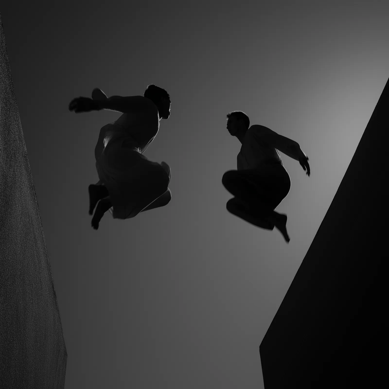
- Black and white only.
- People in motion: leaping, running, moving together.
- Hard light and strong diagonals.
- Minimal frames with one idea per image.
- Headlines over imagery use Acid and Violet 400.
These four images come from Brand Book v1. Confirm usage rights before using them outside Actions.
Key visuals and text
Actions createconsequential companies.
High-conviction,Hands-on.
05
Verbal Identity
The way we present ourselves to the world in the written word.
Words Can Fail: Actions Prevail
Because actions are louder than words, we do more than say. We live this in our brand communications.
In Founders We Trust
Our writing shows we understand what founders are facing, solving, and accomplishing. How we work with them becomes evident as a result.
Emphatic Empathy
We’ve been doing this for 18 years and have been beside founders when things get rough, the most important time to be understanding. Our tone helps founders plow through the problem and come out stronger.
Bravery in Clarity
Founders take risks, so we owe it to them to have the courage to tell things straight.
Human = Humor
Being human in this industry means laughing once in a while. A bit of irreverence shows we’ve been through it all and lived to tell the tale.
Unwavering vs “Weathervaning”
We have a particular view of the world and how to invest in it. We don’t shift with trends or gimmicks, which means we support and stay with our founders.
Voice in use
Lines from Brand Book v1. Short, declarative, and about doing.
It’s better to show than tell. To do than say.
Typography in use
Words can be strong. Actions are stronger.
Typography in use
High-conviction, hands-on.
Key visuals and text
Prepared to build consequential companies.
Website colour application
Applying the voice Proposed
One voice, tuned to the reader. Drawn from the tone principles above.
| Context | Register | In practice |
|---|---|---|
| Founders | Emphatic, straight, a little irreverent | Name the hard thing first, then what to do about it. |
| LPs and investors | Conviction without hype | Show the work: what we did and what happened, not what we believe. |
| Product UI | Less is better | Lead with the verb and say what happened: “2 intro paths found.” “Export shortlist.” |
06
Channels & Assets
The content series, the event series, and the website.
The content series
Re: Actions
Each decision a founder makes, every action they take, has lasting consequences: for their company’s success and for its impact on the world. Our content illustrates the actions founders took at key points so other founders can benefit from the advice.
- Less is better. Shorter is sweeter. We do less content and do it really well, which leaves more time for founders.
- Resharing is caring. We only share what really makes an impact for founders and their companies.
- Is it creating value? If the content isn’t creating value for founders, we don’t do it.
- The spotlight’s not on us. It’s on the actions founders take. The VC is to the founders as the gallery is to the artist.
Formats: behind-the-scenes tours of select portfolio companies, non-obvious scenarios and strategies, founders’ “actions” highlights.
The event series
Inter: Actions
The world benefits from people with a founder’s mentality. Here’s where we gather to celebrate the founders whose actions speak louder than words: to get loud, and to get excited for all that’s ahead.
- Focus on the founders. Too many VCs treat events as self-promotion. We don’t.
- Don’t be so serious. Humility and humanity are the true ways in to real connection.
- Go deep, not wide. Programming gives founders actionable information to walk away with.
- Experience over education. Shared experiences and breaking bread; never talking at people.
Website colour application
Headlines in Geist Light and Violet 600, supporting copy in Not Black 800, and Acid for rollovers. Hover the buttons and links.
Prepared to build consequential companies.
First-check partners for founders in critical industries.
Pre-seed is all we do. We work with founders as it happens, so they can make the most informed long-term decisions. See how we work.
07
Extended Palette
Brand Book v1 defines brand colours, not product states. These semantic tokens extend it for the LP research app. Components use semantic names, never raw palette values.
01Semantic tokens
Component → semantic token → palette colour. Change a mapping once and every component follows. Tailwind utilities use the same names: bg-page, text-ink, bg-action.
| Token | Maps to | Value | Use |
|---|---|---|---|
--color-page | Not White 100 | Page background | |
--color-raised | Not White 50 | Cards and panels | |
--color-sunken | Not White 150 | Wells, stripes | |
--color-brand | Violet 800 | Violet panels | |
--color-ink | Not Black | Primary copy | |
--color-ink-secondary | Not Black 700 | Supporting copy | |
--color-ink-muted | Not Black at 70% | Captions (lightest AA grey) | |
--color-heading | Violet 600 | Headlines on light | |
--color-accent | Violet 500 | Markers, active states | |
--color-line | Not White 300 | Borders, dividers | |
--color-line-control | Not Black at 55% | Form-control borders | |
--color-action | Acid 500 | CTAs and rollovers | |
--color-on-action | Not Black | Text on Acid | |
--color-focus | Violet 500 | Focus ring on light | |
--color-focus-on-dark | Acid 500 | Focus ring on dark and violet |
02Status Proposed
Outside the brand palette by necessity, and checked for colour-blind separation on Not White. Always pair a status colour with an icon and a label, never colour alone.
Connections are 30 days old. Ask each partner for a fresh LinkedIn export before the next LP meeting.
| State | Icon or mark | Text | Wash |
|---|---|---|---|
| Positive | |||
| Caution | |||
| Critical | |||
| Neutral |
03Relationship strength Proposed
A one-hue Violet ramp for how well a team member knows an LP, light to dark. It passes an ordinal-ramp check on Not White. Pair it with a text label.
| LP | Best path | Strength |
|---|---|---|
| Example Family Office | Partner A · direct connection | Strong |
| Example Foundation | Partner B → shared connection | Medium |
| Example Pension Fund | No known path | None |
04Interaction
Acid marks anything you can act on. Violet marks focus and selection on light surfaces.
Buttons and rollovers
Hover: Acid 400. Pressed: Acid 600. Text stays Not Black.
Control border: --color-line-control. Focus ring: 2px --color-focus, offset 2px. Select text to see the Acid selection colour.
08
Governance
The rules that keep the brand on course, the decisions still open, and the files.
Do
- Keep compositions mostly Not White.
- Use Not Black only for copy.
- Make Violet the dominant accent.
- Save Acid for actions: CTAs and rollovers.
- Set headlines in Geist Light; use Semi-Bold only to highlight body copy.
- Keep paragraphs at 130% line height and 50–75 characters per line.
- Shoot key visuals in black and white.
- Use the solid brandmark at small sizes.
- Make sure the brand is always legible.
Don’t
- Show the logotype without the brandmark.
- Lock up the tagline with the logo.
- Use Bold for headlines. We don’t shout.
- Set text in Acid on light backgrounds.
- Recolour the logo outside its three colourways, or stretch, rotate, or retype it.
- Overuse the tagline.
- Use colour photography for key visuals.
- Round the corners of panels, cards, or images.
- Use the lined brandmark before it is approved.
Open decisions
Gaps and inconsistencies found while synthesizing Brand Book v1. This edition’s working choice is noted for each.
Lined brandmark. Marked “Needs decision” in the brand book. Working choice: excluded.
Headline font name. Geist is “our primary and only font,” but the line-height rules cite Favorit Semi-Bold and Medium. Working choice: Geist Light, as the samples on that page show.
Headline line heights. The specimen uses 97% and 105%; the rules page uses 85–100% and 90–100%. Working choice: specimen values by default, rules-page values for short and long copy.
Not Black swatch. #2C2C2C isn’t a step on the Not Black scale. Working choice: kept as the base copy colour, as the logotype uses it.
Solid brandmark tone. One page uses Not Black 950, the colourway page uses 900. Working choice: the colourway page, the middle tone of each shaded set.
Number of colourways. The text mentions four colourways; three are shown. Working choice: three.
Not yet defined. Iconography, status colours, spacing, grid, minimum logo sizes, and motion. Proposals in this edition are marked.
Downloads
Logo artwork is traced directly from the brand book’s vectors.
brand/tokensJSON